As early as in the 1990's the first smartphones appeared. But only with the iPhone by Apple in the year 2007 the all-rounder mobiles came out big. Since then it is hard to imagine a world without them. But how do they communicate with the internet? What is to be considered regarding their display resolution? And what do webmasters have to do to make a page visible on a smartphone?
Interfaces
One hears time and again of the difference between 2G, 3G, and 4G. The "G" in this case is for "generation". The matter is the mobile phone networks of the second, third and fourth generation. The normal talk on telephone is transmitted via the first generation network. The second generation (2G) is also called GPRS or EDGE. Those who want to stream videos should have a 3G network at most. It is also called UMTS, HSDPA or HSDPA+. The fourth generation, the LTE network, is currently under construction. In the future a speed of up to 300 Mbit/s is said to be possible with LTE.
Besides these mobile phone networks connections, mobiles can connect to the internet via WLAN or with other devices via bluetooth. WLAN means Wireless Local Area Network. With WLAN wireless interenet connections are possible. With Bluetooth data connection is possible, but the distances at where it can be used are lower. Bluetooth was especially developed for contiguous devices and it also saves a lot of energy when compared to WLAN.
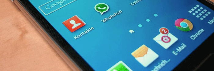
Display Resolution
With smartphones the display resolution moves into spheres where differences are hardly detectable with the human eye. This limit at a distance of 30 cm is said to be at 300 ppi. The next generation of smartphones will be a lot better than that. The HTC One already has a resolution of 468 ppi, 1280 x 720 pixel at 4.7 inches.
You can find a good overview of smartphone brands and their display resolution here.
Responsive Operation
A responsive website reacts to the devices that are used to diplay the website. If one uses a smartphone to access the website, the website changes its design so as to best display on the smaller screen and to be easier to operate with touchscreens. There is a difference between a responsive website and a website built for smartphones that is written seperately and that sends the user to a specific site according to device.
You can find good examples of responsive webdesign here.