
A user friendly design needs a suitable layout. The choices of font types as well as colors have to be harmonized to guarantee an optimal appearance. But how do type fonts differ? How will the colors look like on the display? Below, you can find a short overview.
Typography
Typography is the art of printing or typesetting. By choosing the right typesetting texts are easier to read. The typeface appears more pleasant. Besides the microtypography, which looks at the form of the letters, typography also entails the space between the letters, the space and lengths of a line and much more.
When creating texts it always has to be evaluated whether serif font types or sans serif font types (grotesque) are to be used. Serifs are strokes to emphasize the letter, to give a horizontal orientation for the eye. They enable a more pleasant reading experience, especially in longer continuous text. An example of a sans serif font is Arial, a font with serifs is Times New Roman. Since there is no long continuous text on the displays in digital signage or in lifts sans serif font types should be used.
 Furthermore, we differentiate between proportional and monospaced font types. Proportional fonts set different widths for each letter, while letters in monospaced fonts are all the same width. Nowadays, most users choose proportional font types. Monospaced font types are sometimes found in advertising.
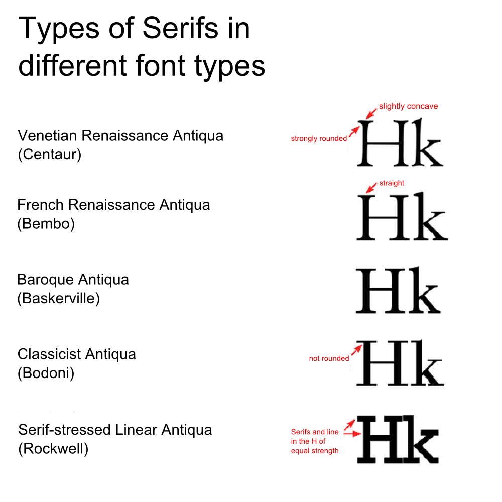
Font types are normed in Germany . The DIN has been issued in 1964 and distinguishes 11 different font groups. We portray the first five in our following image. They are ideally suited to show differences in serifs.
Colors
Color is a property of the light that people perceive. The threshold of perception is between 380 nanometers (purple) and 750 nanometers (red).
| Color | Wavelength |
|---|---|
| Purple | 380-420 nm |
| Blue | 420-490 nm |
| Green | 490-575 nm |
| Yellow | 575-585 nm |
| Orange | 585-650 nm |
| Red | 650-750 nm |
![]()
Colors usually occur not as pure colors but in mixed form. Displays use an additive color mix. At the subpixel level red, green and blue are combined. These colors are perceived in their sum because the human eye cannot distinguish between them at this size. It was possible to see the RGB colors in earlier TV models when watching from a very low distance. With the introduction of FullHD resolution the subpixel decreased significantly is size. But the screen diagonal increased. With the upcoming 4K-displays the pixels are too small to be seen by the human eye. As with smartphones and notebooks this is called retina resolution.
When we speak about the color of an object that does not emit light, we always speak about the light that has not been absorbed by the object. If light strikes a lemon the surface of the fruit absorbs the blue light. The red and green light is reflected and perceived as yellow by our senses.
In ink-jet printers we have a different type of color mixing. Here we talk about a subtractive color mix. Since with every new mixing of color the object absorbs more and more light, the mixed colors are increasingly dark. In the additive color mix they are lighter after every mixing.
For print material the colors cyan, magenta, yellow and black (key) are used - the CMYK color system.
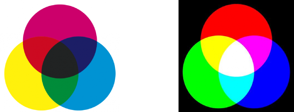
The CMYK, a subtractive color mix, on the left. The additive RGB color mix on the right.
Choice of color
Besides an easy handling, the right choice of colors is crucial to set a user friendly interface. Color combinations determine attention points and have a potential impact on viewers' emotions. For example, blue colors are considered cold, red colors give a feeling of warmth. Green colors seem to possess calming properties, which might be a result of evolution, as the color has always been linked to the absence of drought and a vivid environment.
We should also keep cultural differences in mind regarding the interpretation of colors. White, for example, represents sorrow in Japan.
Finally, it has to be said that individual tastes with regards to colors vary as well and corporate design has to be part of the equation when choosing a color in business.